↓
JAVASCRIPT IS DISABLED. Please enable JavaScript on your browser to best view this site.
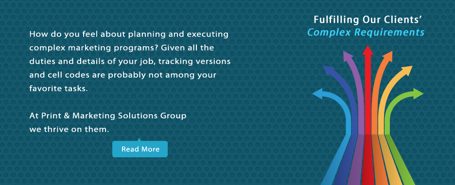
Print and Marketing Solutions Group
Search for:
Home
About
Client Testimonials
Case Studies
Blog
Services
Fulfillment & Mailing
Lists & Data Services
Personalization
Print Management
Printing
Magazine Printing & Mailing
Catalogs, Books, Brochures
Digital Publications
Mobile Apps
Digital Catalogs
15 FRESH IDEAS for Marketing Your Books
Direct Mail
Custom Packaging
Member & Loyalty Cards
Forms & Envelopes
Labels & Signs
Video Brochures
Campaign Tools
CustoMarcom™ Portal (Web to Print)
Variable Data Print
Personalized URL (PURL) Campaigns
OptiChannel Marketing Automation
Merch – SWAG
Virtual Ideas
Associations
Contact
↑